Important Information
You are visiting the international Vantage Markets website, distinct from the website operated by Vantage Global Prime LLP
( www.vantagemarkets.co.uk ) which is regulated by the Financial Conduct Authority ("FCA").
This website is managed by Vantage Markets' international entities, and it's important to emphasise that they are not subject to regulation by the FCA in the UK. Therefore, you must understand that you will not have the FCA’s protection when investing through this website – for example:
- You will not be guaranteed Negative Balance Protection
- You will not be protected by FCA’s leverage restrictions
- You will not have the right to settle disputes via the Financial Ombudsman Service (FOS)
- You will not be protected by Financial Services Compensation Scheme (FSCS)
- Any monies deposited will not be afforded the protection required under the FCA Client Assets Sourcebook. The level of protection for your funds will be determined by the regulations of the relevant local regulator.
If you would like to proceed and visit this website, you acknowledge and confirm the following:
- 1.The website is owned by Vantage Markets' international entities and not by Vantage Global Prime LLP, which is regulated by the FCA.
- 2.Vantage Global Limited, or any of the Vantage Markets international entities, are neither based in the UK nor licensed by the FCA.
- 3.You are accessing the website at your own initiative and have not been solicited by Vantage Global Limited in any way.
- 4.Investing through this website does not grant you the protections provided by the FCA.
- 5.Should you choose to invest through this website or with any of the international Vantage Markets entities, you will be subject to the rules and regulations of the relevant international regulatory authorities, not the FCA.
Vantage wants to make it clear that we are duly licensed and authorised to offer the services and financial derivative products listed on our website. Individuals accessing this website and registering a trading account do so entirely of their own volition and without prior solicitation.
By confirming your decision to proceed with entering the website, you hereby affirm that this decision was solely initiated by you, and no solicitation has been made by any Vantage entity.
I confirm my intention to proceed and enter this website Please direct me to the website operated by Vantage Global Prime LLP, regulated by the FCA in the United KingdomBy providing your email and proceeding to create an account on this website, you acknowledge that you will be opening an account with Vantage Global Limited, regulated by the Vanuatu Financial Services Commission (VFSC), and not the UK Financial Conduct Authority (FCA).
-
Please enter a valid email address
-
Please tick the checkbox to proceed
-
Please tick the checkbox to proceed
Please tick all to proceed
×
-
 REGISTER
  LOGIN
LOGIN-

View More
SEARCH
Keywords
- Forex Trading
- Vantage Rewards
- Spreads
Popular Search
- Trading Accounts
- MT4
- MT5
- Copy Trading
- Promotions
Thank you for your interest in viewing this course content. To continue, please fill in the form below.
![]()
xxxxxxxxxx
Please enter your name
xxxxxxxxxx
Please enter a valid email
Email is case sensitive.
Where did you hear about us ?
Please tick the checkbox to proceed
Demo Account Form
You are not an existing user. Please register to continue.
xxxxxxxxxx
Please enter your frist name
xxxxxxxxxx
Please enter your last name
xxxxxxxxxx
Please enter a valid email
xxxxxxxxxx
Please enter a valid country
No results found
xxxxxxxxxx
Please enter a valid province
No results found
xxxxxxxxxx
No results found
xxxxxxxxxx
Please enter your phone
Please tick the checkbox to proceed
Important
Vantage Global Limited does not accept applications from Australian residents.
Due to regulatory requirements, when you click 'continue' you will be redirected to the Australian website of Vantage, which is operated by Vantage Global Prime Pty Ltd - a company registered in Australia and regulated by the Australian Securities and Investments Commission (ASIC), AFSL no. 428901.
CONTINUEPlease wait
Error! Please try again.
![]()
Thank you
You can proceed and enjoy the course! You will be redirected shortly.

3.1 Different types of forex charts
We know that forex traders rely heavily on forex charts to read market trends and plan their trades, but why is this so? Well, forex trading is about reading the price movements of a currency pair, and to do so you’ll need a way to discern the pair’s historical and current price behaviour.
Enter the forex chart – or more accurately, a price action chart – which is a visual representation of price changes over time. Additionally, a price action chart is a record of the trading activity that takes place over a single trading period, be it minutes or hours, to days, weeks, months or years.
Hence, a forex chart is an integral tool that every trader should learn – even if you do not plan to rely heavily on technical indicators to guide your trading decisions.
Here are 3 of the most common forex charts beginners should familiarise themselves with.
Line chart
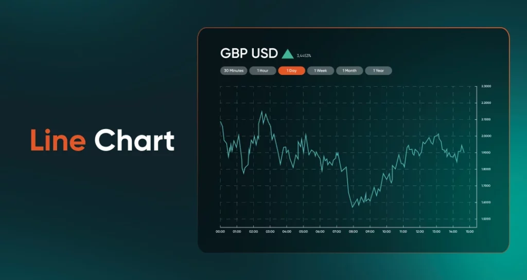
A line chart uses a single, straight line to plot the price of a currency pair as it moves up and down over time. Owing to its straightforward nature, line charts are effective for showcasing trends, yet they lack more intricate details. You may use it to discern the price level of a currency pair at the end of each trading day, but only with a limited scope of information.
Best for: Big picture view of price movements.
Bar chart
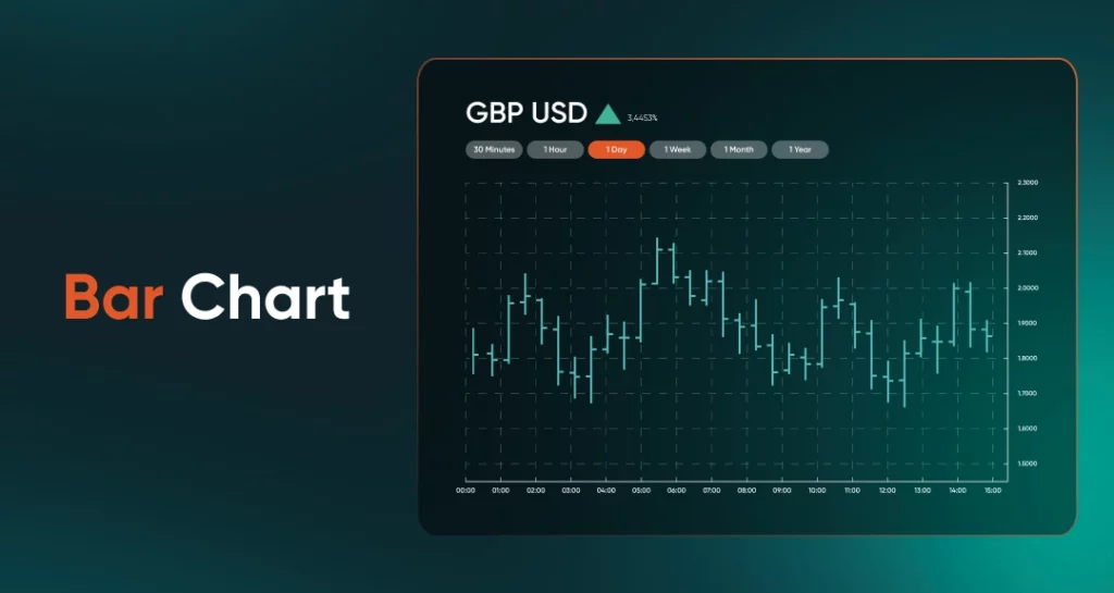
A bar chart provides a little more information than a line chart. Rather than a continuous line, it is made up of different bars – each bar represents one segment of time – such as an hour, a day, a week etc, depending on how the chart is scaled.
More than just displaying price trends, a bar chart also indicates volatility. To understand how, let’s zoom into an individual bar.
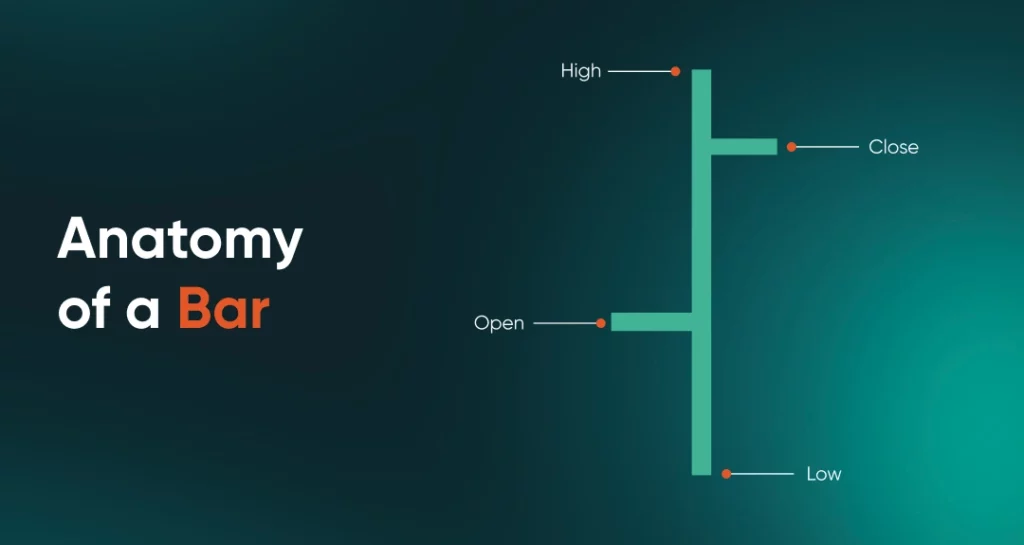
For this example, let’s assume this bar represents one trading day. We can see the highest and lowest price reached by the currency pair that day (High and Low) as well as the prices at opening and closing (Open and Close).
The difference between High and Low shows volatility – a larger difference will result in a longer bar, and a smaller difference will result in a shorter bar. Hence, if you see several long bars in a row, it means the currency pair is experiencing high volatility, and vice versa.
Incidentally, bar charts are sometimes referred to as OHLC charts, which is an acronym for the four data points each bar indicates – the Open, High, Low and Close.
Best for: Visualising trends, spotting volatility
Candlestick chart
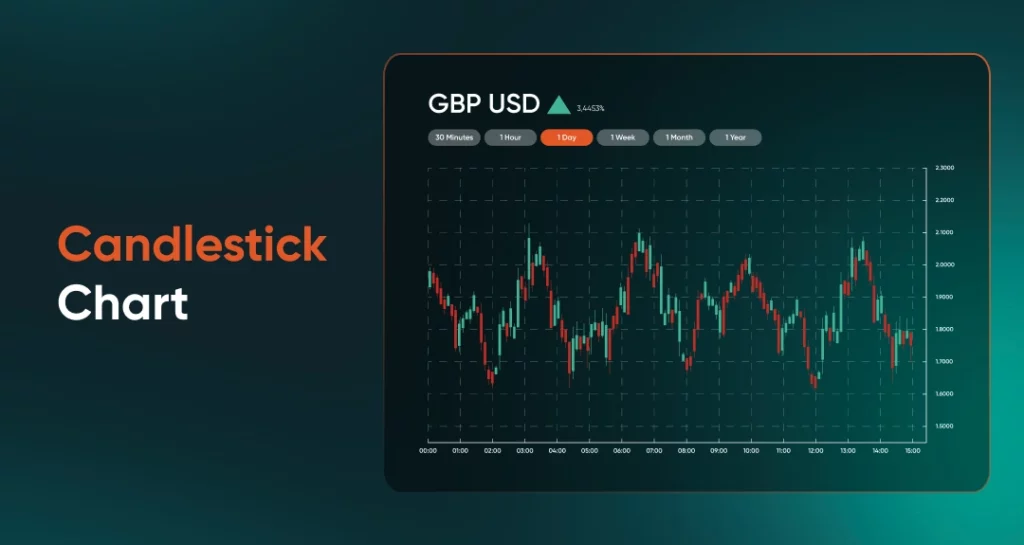
While bar charts contain useful information, they aren’t the easiest to read. You’ll need to zoom into individual bars for a clearer picture of what’s going on.
A need for greater readability is likely what drove the advent of the Candlestick chart, which is basically the same as a Bar chart, but presented in a format that is easier to read and understand.
Let’s zoom in for a closer look:
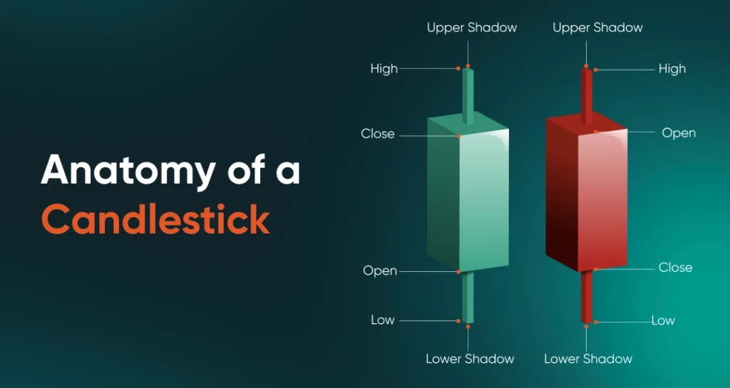
As you can see, the Candlestick chart offers the same four data points as a Bar chart – Open, High, Low and Close.
However, in a Candlestick chart, the height of the block represents the difference between the Open price and Close price, while the High price and Low price reached during the trading day is represented by the vertical lines sticking out at both ends of the block.
Incidentally, the combination of block and vertical lines resembles a candlestick and its wicks, hence the name.
Candlestick charts also use a pair of colours to offer an additional piece of information – change in price direction.
Here, the green block on the left means that the currency pair closed at a higher price than the day before. However, the red block on the right means the currency pair closed at a lower price the next day.
So for example, if a series of long green candles is followed by a short red candle or two, a downtrend may be coming.
Hence, on a Candlestick chart, is it far easier to spot bearish or bullish trends, as well as inflection points that may indicate trend reversals.
Best for: Discerning trends and possible reversal points in an intuitive way
3.2 Candlestick anatomy
Due to their popularity and importance, it’s essential to have a deep understanding of Candlestick charts. Specifically, the anatomy of a Candlestick bar can tell us some important information.
We already know that the length of the block (or “the real body”) represents the difference between the Open price and the Close price. Hence, a candlestick with a short real body means that prices did not move much that day, while one with a long real body means there was significant price movement that day.
Note that when the closing price is lower than the opening price, the candle is a bearish one, and commonly appears red on the chart. When the closing price is higher than the opening price, the candle is a bullish one, and appears green on the chart.
Green and red are just the most widely used pairs of colours to differentiate between bullish and bearish candles. You can choose your own combination of colours to use, such as black/white, blue/yellow, etc, as long as you’re clear which colour represents what.
Similarly, the wicks (sometimes known “shadows”) at the top and bottom of the real body can also convey information; they represent the degree of price fluctuation (and hence market sentiment) during the trading period.
Additionally, the length of the wick relative to the real body can also be taken as bullish or bearish signals.
A long top wick forms when the price goes up, but moves back down to close much lower – this can be read as a bearish signal. Conversely, a long bottom wick forms when the price goes down, but moves back up to close markedly higher – this can be read as a bullish signal.
Meanwhile, short top wicks means that prices closed not far from the high for the day, which can signal a coming price rise. And short bottom wicks mean that prices closed near to the lowest price for the day, indicating that a price drop is likely.
All these mean that each candlestick can appear differently from day to day or period to period, depending on the trading activity that took place. Wicks could be long or short, and real bodies could be tall or short, and knowing how to read them will help you become a more knowledgeable trader.
3.3 Candlestick patterns: Bullish, Bearish and Consolidations
As you read a Candlestick chart from left to right, the candlesticks will begin to tell a story.
Generally, you will notice three periods within a price chart. If you see a period where prices steadily increase, that’s when the market is bullish. If you see a period where prices decline, that’s when the market is bearish.
And if you see a period where prices don’t seem to move much from period to period, that’s known as a consolidation; this is usually followed by a bullish uptrend or a bearish downtrend.
The cool thing about candlesticks is that the patterns they form can be used to spot bullish or bearish inflection points, potentially signalling a trading opportunity in forex. However, understand that candlestick patterns are not guarantees of uptrends or downtrends – they are merely describing price tendencies.
Here are some common bullish and bearish candlestick patterns to look out for. However, there are no definite patterns for consolidations – prices simply remain flat.
Bullish candlestick patterns
Hammer
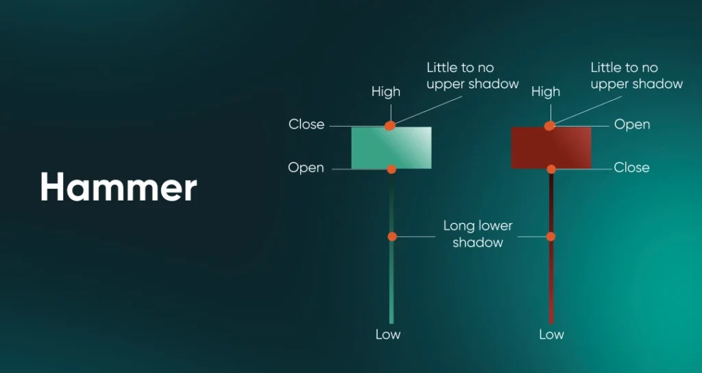
A Hammer candlestick pattern is a single green candle with a short body and a long bottom wick (at least two or three times the height of the candle), with little or no top wick. Its appearance during a downtrend may signal an oncoming bullish reversal.
Inverse Hammer
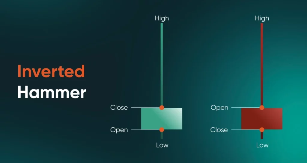
A related pattern is the Inverse Hammer, which is exactly as it sounds like – a short green body with a long top wick, and little to no bottom wick. This pattern may likewise indicate a coming bullish uptrend if it appears during a downtrend.
Bullish Engulfing

This pattern forms when a short red candle is followed by a much longer, green one. This indicates that bulls are in control and could push prices higher.
Three White Soldiers
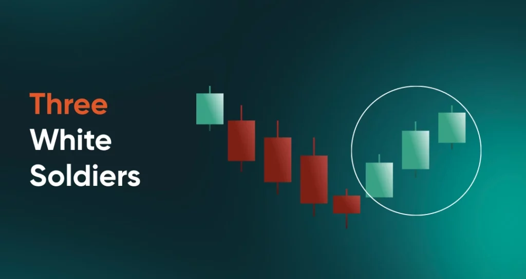
Following a severe downtrend, three consecutive green candles appear, with each one closing higher than the last. The rising momentum seen in the three green candles – especially if each body becomes longer than the last – is seen as paving the way for an uptrend to take hold.
Bullish Rising Three
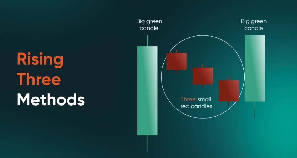
A series of five candlesticks, with the first and fight ones being green, and the middle three being red. The thing to note in this pattern is that red candles stay within the price range of the first green candle.
Also, despite three consecutive days of falling prices, a new low is not seen. The pattern is capped off by another long green candle on the fifth day, which signals another upswing is in the works.
Bearish candlestick patterns
Hanging Man
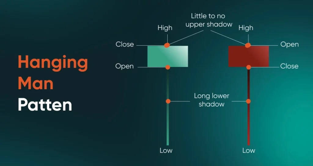
A Hanging Man pattern resembles a Hammer – i.e., short body with long bottom wick – and similarly indicates a trend reversal. However, the difference is that a Hanging man pattern is a red candle, and its appearance during an uptrend could signal the start of a downtrend.
Shooting Star
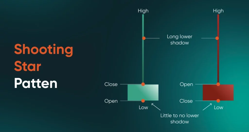
The counterpart to the Hanging Man is the Shooting Star. This is a single red candle that has a short body with a long upper wick. When it appears at the peak of an uptrend, a downturn may follow.
Bearish Engulfing
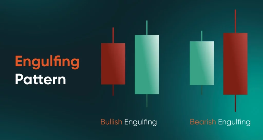
A two-candle pattern where a green candlestick is followed by a larger red one. This indicates a swift reversal in sentiment in the market, and may be a sign of more selloffs to come.
Evening Star
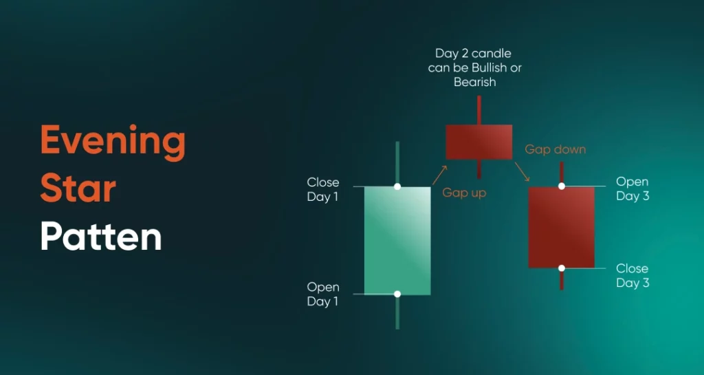
In this bearish pattern, only the first and the third candles are compared. The middle one may be a candle with short body and short wicks (also known as a “top”, or “doji”, a pattern that signals indecisiveness in the market) that is red or green.
The change from a long green candle to an indecisive one points to a break in momentum, and the following red candle further cements a switch to the downtrend.
Bearish Falling Three
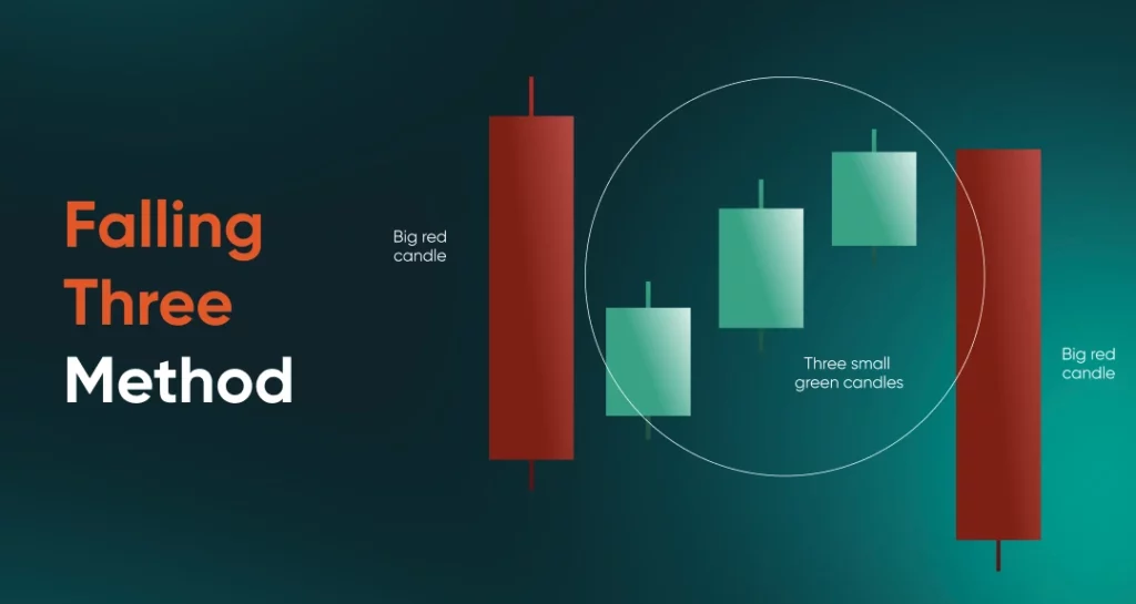
In this five-candle pattern, the first and last candles are red, with three smaller green candles in between. This indicates that despite concerted effort, the bulls weren’t strong enough to wrest control away from the bears. Hence, a Bearish Falling Three pattern indicates another downward phase is in the cards.
Check out a more in-depth article regarding candlesticks patterns.

Module Recap
- Forex charts – or more properly, price action charts – are an essential tool for traders to learn, as they provide basic but important information such as price trends and reversal points that may be potential trading opportunities.
- Three common forex charts are line charts, bar charts and candlestick charts. Of the three, candlesticks provide more information than line charts while being easier to read than bar charts.
- A candlestick chart is made up of individual candles, each representing a trading period (such as an hour, a day or a week, etc).
- Candles are made up of a rectangle (the real body) and wicks or shadows on the top and bottom.
- The length of the candle’s body tells us the difference in price between opening and closing. When the closing price is lower than the opening price, the candle is a bearish one and is traditionally coloured red. When the closing price is higher than the opening price, the candle is a bullish one, and is traditionally coloured green.
- The length of a candle’s wicks tells us the difference between the highest/lowest price and what the price ultimately closed at. This can be taken as a measurement of market sentiment.
- Long top wicks may be read as a bearish signal, while long bottom wicks may be read as a bullish signal. Short top wicks may be a bullish signal, while a short bottom wick may be a bearish signal.
- Candlesticks reflect the trading activity of the period, and can thus appear differently from day to day. The appearance of certain candlestick shapes and patterns can indicate bullish or bearish trends.
- Bullish candlestick patterns include the Hammer, Inverse Hammer, Bullish Engulfing, Three White Soldiers and Bullish Rising Three
- Bearish candlestick patterns include the Hanging Man, Shooting Star, Bearish Engulfing, Evening Star, and Bearish Falling Three
- Candlestick patterns do not guarantee the onset of a bullish or bearish trend. Instead, they should be taken as descriptions of price tendencies.
Previous Lesson
Next Lesson